Wednesday, July 25, 2012

Graduation Dress

 Yup. Since I didnt find a dress of my taste or that wasnt excessively expesive, I did my own dress. Made this in 2 days, 'cus that was the time remaining for the graduation. xD
Hah... Well, its past a month now, but took some pics along the way and here they are~ c:

The sketch~ Something with a twist of victorian-ish loli dresses + military elements? Before buying the materials, it has to be certain what the heck I will be making. xDD
And yup, I drew this in April, but still left the material and sewing part in the last minute.
I made several desing sketches, but this was the one I liked the most. :)

The very first idea was to make a white or blue-ish dress, but somehow ended up with the classic black-white-red combination. Again. :|
I loove velvet~ So, bought black velvet, three different shades of red velvet, white cotton and black lace fabric. The buttons are plastic. Also bought some red velvet and black lace later.
I kept all the checks, summed up the costs and the total was ~30€. The most expesive material was the black velvet (half of the total). :I

 Let the trial-n-error part begin! No, I didnt use any kind of magazines given patterns for this. Heck, Ive never used one :I
Took the main lines from a T-shirt and drew out the rest with free hand using chalk. Constantly checked, that everything would be in the right size. Its always better to draw/cut out the pattern a bit bigger, because you can always sew it narrower without having to rip up anything. Also! Since I use an overlock machine, I have to consider that I have to leave ~1cm spare edge everywhere.

Front and back pieces. Also made slits for the back pices later- to make it "sit" better on the figure.

Ive had some very terrible experience before with pins and shifty velvet. Sewing the parts together by hand before sewing with the machine is a must! I wanted to make this as a half corset dress, but I was short on the glued fabric. -.-

The skirt part! First cut a rectangular shaped pice of the longest side of the black velvet (about 150cm) and then tried shaping the folds with pins on the mannequin.

Carefully took it off from the mannequin and marked the folds on the back side of the fabric, cut the unnecessary upper part.

Took out all the pins, folded the fabric in half and cut the other side in the same shape +added mirrored folds markings.

And pinned everything together again. :D

Sewed on the hidden zipper...

...and then pinned and hand sewed on the white skirt part whit the upper body part. The mannequin is upside down here. I pinned down the sides and then started dividing the fabric in half- pinned down a point, divided in half again and pinned down. The white skirt part is a rectangular shaped pice sewed together with the black lace fabric. The black skirt part from before is also under there.

The sleeves~

Welp, the half circle shape didnt hold shape like I expected it to and the second half cirlce shaped sleeve came out a bit bigger... So, boldly cut it shorter. c:

I wanted to make a lil' red bow on the back. ^^
Cut out a rectangular shape- folded in half- sewed together- tuned the right side out- folded together the open sides and "frilled" it together. Did the same with the other side, sewed both together, and voila~ A bow look alike. :D

Did the same with all the 3 shades of red and sewed the pices together. 
Now that I look at it... I guess it would have been better, if it was a bit bigger. :I

TADAH~ :D
Added lace on every edge, golden buttons + chain and the front frilly red thing is sewn on by hand. The rose is made from a satin dark red lace.


Hah... I guess its good enough for 2 days. xD

Tuesday, July 3, 2012

Portfolio

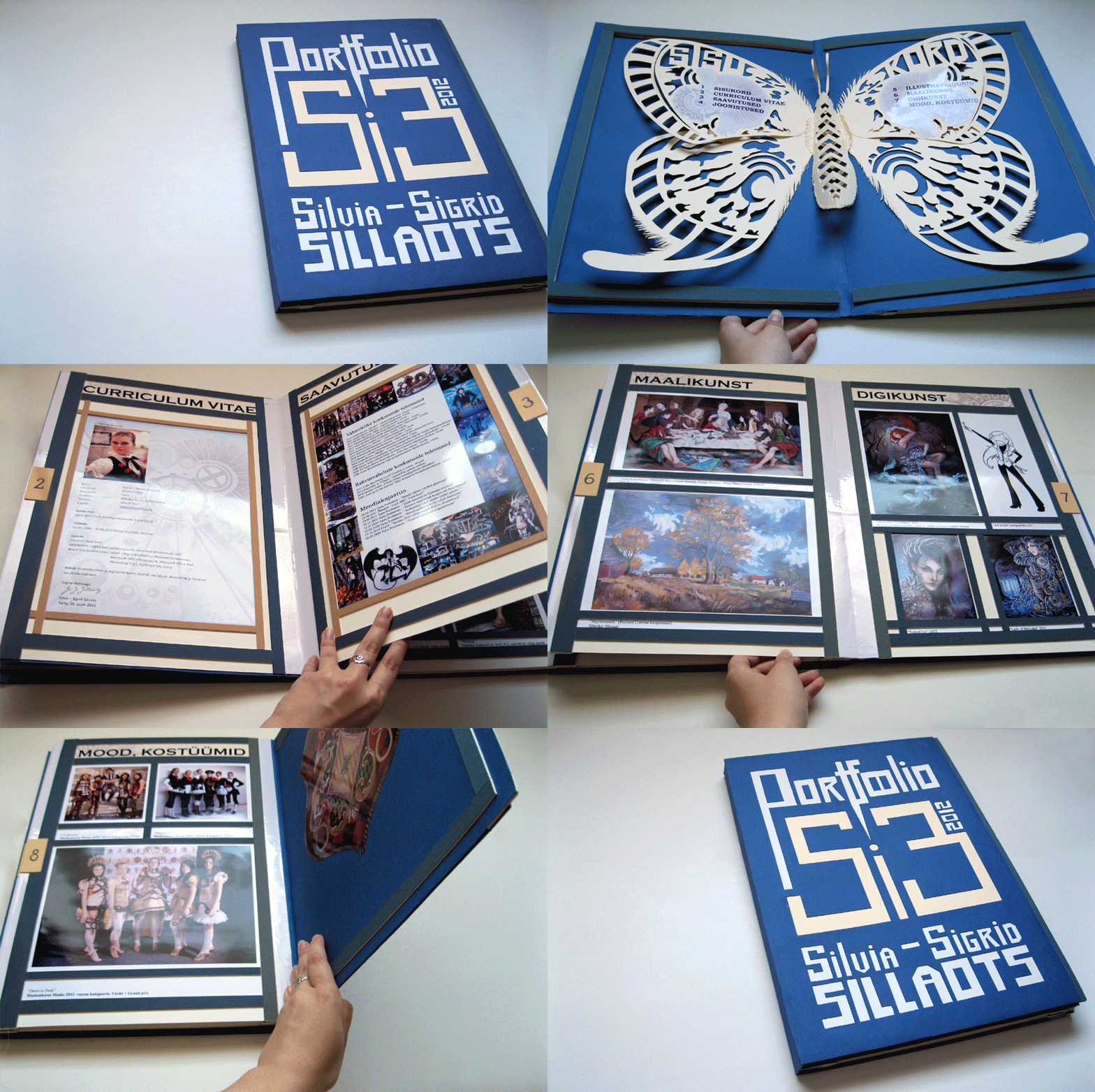
So~ Finally came the time I had to make a portfolio in order to caditate to Tartu Kõrgem Kunstikool (Tartu Higher Artschool? :D) I wanted to continue studying at the "media and advertising art" and for that the first step was to hand in a "perfect" portfolio. Heres the process of mine~ 

Also, there was the evaluation criteria, what to keep in mind:
¤ Cross-compliance (format A3, pages 4-9)
¤ Presence of all the components (CV with a photo, contents, examples of arworks and /or design sketches)
¤ Personality/Style
¤ Creativity / Versatility
¤ Harmony of colors /Coloring
¤ Compositional solutions
¤ Technical solutions /Different techniques
¤ The content and format /Whole interaction
¤ Aesthetics /Correctness

The max was 10 points, tho it looks like the 10th point is missing over here. :I

 
As always, the most important thing before creating anything. The sketch~ :)
Hah... Didnt have any idea for the colour of the cover tho.

 This was my colour swatch. Got some special carboard scraps used for mounting arworks/photos from school. c:

Luckily, got some sheets of A1 sized white cardboard from school, cut them to A2 and folded together to A3. :D Since I used a bit blunt edged craft knife and the edges came out sort of "shredded"... then decided to cut another 4cm wide strip of white adhesive paper and covered the horrible edges.

 To get the width of the cover's "spine" I had to put together all the pages + the mounting carton.
Hah! Thats a lot of layers in there and considering theres only 8 pages. xD

 Now then~ After a sleepless night, non existant corrections and tosens of typos, I finally got the content ready for printing. Ugh... I srsly hate my printer... It added an extra contrast and magenta layer on every gawd damn pic, that they dont look anything near the originals anymore... And like that wasnt enough, it printed 15 pages for 4 hours! >:U But... I got my pages. :I

Then cut different coloured straps and tried fitting them together.


  Got the main colours in place and then glued on the inward blue straps and sewed the pages together. The last time I did book binding was in 9th grade. c:

 Now that all the main preparation are done, its time for the cover! Measured the damn lines one whole day and then cut out the letters with the help of a cutting mat, metal ruler and another crafting knife.

 Also, got this crazy idea, that there shall be a pop-up butterfly as the contents page, the text on the wings. Used some of the letters from the cover as templates.

Almost... Done... Almost. D: My fingers were all blistered and bleeding from papercuts at this point.
But theres no turning back now! 

 After another sleepless night, got the wings all cut out. By now, I had glued the blue paper with text and inside pages together with the cover. Glued the butterfly with PVA inside the first pages. I wanted the wings to hold up a bit away from the cover and for that glued ^that^ kind of thingamajigs under the wings.

 It didnt push away the wings as much as I wanted because of they are too big and heavy for it, but its still better than the wings sitting flat on the cover. :)

 Tadah~ Fancy, eh? The only purpose for it was to get the judges excited of what might come after this.
But actually because... Im madly obsessed with butterflies. ;)

Also glued a bit wider edges over here, to make a kind of a "gap" for the butterfly.


And finally the finished thing~
CV, Achivements (all kind of competitions 1st places + a frame of the winning entries)

Drawings, Illustrations.

Traditional art, Digital art.

Fashion/Costumery.


And thats it. Well... As much "sweat, blood and tears" I put into it, I can finally say, that this wasnt what the judges were expecting. In both good and the bad way. 
Good- yea... lots of hard work and impressive content. 
Bad- I crafted the damn thing.  >:I

This rather shows Im a crafter and not ready for "dry text processing, animations and videos". 
Hah! Go figure. :D
But at least I had fun making it. :) I just hope I can get it back now that I wasnt accepted to the school. :I

Monday, July 2, 2012

Underwater

As I've been obsessed with the underwater theme for some time, then here is the process of another watercreature aka a mermaid~ :3
 
 I remember I struggled quite long with the hands. :s But now its inked, scanned and ready for watercolours~

 First used some masking fluid. I guess everybody, who has used this liquid, knows way too well what it does to your brushes? :D I've noticed that its much better to use a wooden barbecue stick for applying this especially if you use the fluid for "drippy" white spots. ^^

 First layer of ink + salt. Used yellow, green and blue ink here.
 
 The second layer with watercolours + salt. Yup, double salty texture~

 More detailing and since I was pretty sloppy with the colouring, had to overdraw the main lines with black Unipin marker 0.1 and fixed some lines with white gel pen. (that water wasnt that blue at the bottom... damn camera.... D:)

Finally scanned and tried adjusting the colours as close to the original as I could. :)