Wednesday, June 27, 2012

The Last Art Class

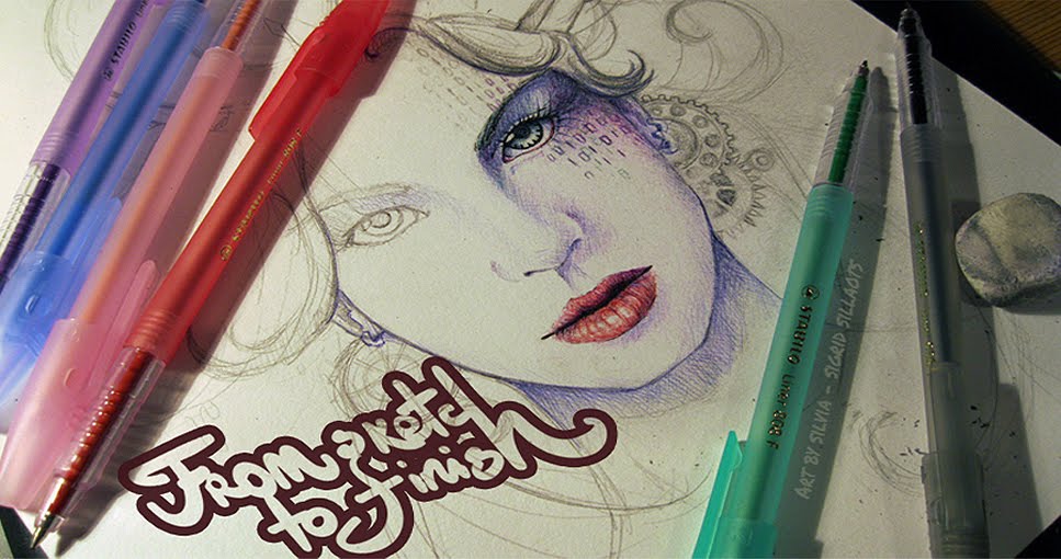
 At the end of every school year we have to make a final thesis graduation art project as part of our art exams. You can make basicly anything for it, but I decided to go for a classical oil painting. As it was our last year together, I got an idea to draw/paint my classmates based on an old painting. And as we have a fairly small class, "The Last Supper" seemed like a legit choice. c: 
Yeah, for the base I chose Jacopo Bassano's last supper painting.
 
------------------------------------------------------------------------------------------------------------ 
 
 Started out with a sketch and nobody in my class was against the idea~
 
So~ Poked ppl and tried to get everybody in a similar enough pose as on the original,  smashed everyhting together and used this as my main reference for the painting. :3

  
During a week finally got  everything in place on canvas.


---------------------------------------------------------------------------------------------------------
 
 Figured I should do the portrait parts next after the bg was done. (not a good idea at all if you dont have a clear vision of the whole colour scheme! D:) Anyway, these two buddies helped me out with the portraits and used Louvre oils.

Its always good to have a reference pic nearby even better if side by side. ^^

 
This is the way I painted all of the portraits. First mixed a skin tone of ochre, sienna and white, covered the darker skin areas and then used a ligter tone of the same mix and tried smudging the lighter and darker parts together. Then added a bit of crimson red, burnt umber and itsy-bitsy ultramarine, higlights on the cheek and nose and finally added other details.  Its also good to paint over the hair part with the skin tone before starting with the hair.

Btw, this is me. :D
---------------------------------------------------------------------------------------------------------
 This isnt the finished version, you can see it at my Deviantart page. ;)
 http://blackbutterfly007.deviantart.com/gallery/#/d55fuz0

And here are some colse-up shots. :3


Wednesday, June 13, 2012

Family Dragon Shield

This was one of my school projects. :) All the students were given a blanc plywood shield shaped pice and the task was to desing your familys "coat of arms" shield part. 
This is what I did.
Its all painted with acrylics in lots of layers.  ;)

 As my father was born in the dragons year, my favorite fantasy creatures are dragons and it is the dragon year once again, it seemed the only logical choise that there shall be dragons on this. And gothic font. c:

 First painted the squared bg part with the tube red and darker lower squares are a mix of red and black.

Second layer with burnt umber + black, diluted with water and trying to get the "aged" look. Used the acrylics as watercolours and wiped over with a tissue  in the near-middle parts.

 Continued in school~ :D Did the green rombs the same way as the red part before.

 Now that everything in the bg is done, its finally time for the golden boarders. Also used a bit of metallic gold acrylic, but most of was done with a mix of ochre, sienna and burnt umber. 

And finally covered with mat acrylic varnish.
This is going to go up on the wall in my grandmothers country house~ <3

Saturday, June 2, 2012

Loki Laufeyson

WOOO~ Finally! I saw the Avengers~ :D Im compleatly stunned with how perfect the whole cast over there is. :o And I think its pretty obvious who was my fav character... Ofcourse its Loki.
 I rewatched Thor and searched for pretty much every avalable interview with Tom Hiddleston. He has left an impression of himself as a sweet-hearted funny guy, so I still dont think that Loki was the bad guy of the movie... Damn those sweet malicious smiles! :s
I guess... Ive been Loki'd, huh? xD

 So yup, had this unresitable urge to draw him. c: Used photo references and mechanical pencil 0.5. :)

 I didnt notice if the shiny trim around his collar and coat was just a square shaped... thing or a zipper... So I made it a zipper. Drew the lineart with a black marker 0.2 and erased the sketch underneath.

 Tried marking the shadows on his face with a sepia toned watercolour pencil first.

 The first watercolour layer~ Mixed together yellow ochre, raw sienna, english red, glaukonite (a shade of green), quinacridone lilac and a bit of cobalt blue. Yeah, double checked all the names of the colours. :) Actually it would be enough for the skin if you have ochre and english red.

Second layer of a a bit darker skin tone. (mixed more cobalt blue).

Ochre base for the  shoulder thing and the lip tone is the same darker skin tone + madder lake red light (dark red). The eye colour is azure blue + cobalt blue.

Intense paynes grey for the hair and a bit lighter on the collar, the cape thing is green+ emerald green.

Intense yellow ochre and a combo of raw sienna+ burnt umber for the darker parts. Did the collar and hair over with tint black tone.

Oh yea... Wanted to make an artsi background, so I grabbed some inks, salt and started mixing~ Used yellow and green ink.

Obviously the bg thing was too much and started to compeate with the portrait, so tried to lighten it with white acrilic. Overdrew some black lines, added lil' details with white gel pen and its ready for scanning~

Typography

Started making this pice somewhere in autumn and bothered enough to take pictures of the progress. ;)
This is one of the most time consuming pictures Ive ever done.

Twilight living on the edge
dazzling the art of danger
tonight we fall from desire's ledge
No Promises, Just Poetry

I have this ancient CD with continious remixed musics and this song's chorus has haunted me for so long... I suppose thats where the inspiration came from. Its called Bonnie Bailey feat. Hot 22 - No Promises (Thomas Gold Remix). First sketched a face, drew on the lyrics and did everything over with a 0.2 marker.

 Cut n' paste! Printed out the lyrics for the background and started randomly cutting the hair from the same white paper.

 Decided that this thing needs some watercolours~

 Glued on the hair with PVA in layers and coloured some of the hair strands along the way.

 The skin looked too pale and flat for me, so added depth with copics E51 and E02.

Added some more strands, scan, photoshop and its ready~
The scanner always eats away the purple tones tho... :I