Tuesday, July 3, 2012

Portfolio

So~ Finally came the time I had to make a portfolio in order to caditate to Tartu Kõrgem Kunstikool (Tartu Higher Artschool? :D) I wanted to continue studying at the "media and advertising art" and for that the first step was to hand in a "perfect" portfolio. Heres the process of mine~ 

Also, there was the evaluation criteria, what to keep in mind:
¤ Cross-compliance (format A3, pages 4-9)
¤ Presence of all the components (CV with a photo, contents, examples of arworks and /or design sketches)
¤ Personality/Style
¤ Creativity / Versatility
¤ Harmony of colors /Coloring
¤ Compositional solutions
¤ Technical solutions /Different techniques
¤ The content and format /Whole interaction
¤ Aesthetics /Correctness

The max was 10 points, tho it looks like the 10th point is missing over here. :I

 
As always, the most important thing before creating anything. The sketch~ :)
Hah... Didnt have any idea for the colour of the cover tho.

 This was my colour swatch. Got some special carboard scraps used for mounting arworks/photos from school. c:

Luckily, got some sheets of A1 sized white cardboard from school, cut them to A2 and folded together to A3. :D Since I used a bit blunt edged craft knife and the edges came out sort of "shredded"... then decided to cut another 4cm wide strip of white adhesive paper and covered the horrible edges.

 To get the width of the cover's "spine" I had to put together all the pages + the mounting carton.
Hah! Thats a lot of layers in there and considering theres only 8 pages. xD

 Now then~ After a sleepless night, non existant corrections and tosens of typos, I finally got the content ready for printing. Ugh... I srsly hate my printer... It added an extra contrast and magenta layer on every gawd damn pic, that they dont look anything near the originals anymore... And like that wasnt enough, it printed 15 pages for 4 hours! >:U But... I got my pages. :I

Then cut different coloured straps and tried fitting them together.


  Got the main colours in place and then glued on the inward blue straps and sewed the pages together. The last time I did book binding was in 9th grade. c:

 Now that all the main preparation are done, its time for the cover! Measured the damn lines one whole day and then cut out the letters with the help of a cutting mat, metal ruler and another crafting knife.

 Also, got this crazy idea, that there shall be a pop-up butterfly as the contents page, the text on the wings. Used some of the letters from the cover as templates.

Almost... Done... Almost. D: My fingers were all blistered and bleeding from papercuts at this point.
But theres no turning back now! 

 After another sleepless night, got the wings all cut out. By now, I had glued the blue paper with text and inside pages together with the cover. Glued the butterfly with PVA inside the first pages. I wanted the wings to hold up a bit away from the cover and for that glued ^that^ kind of thingamajigs under the wings.

 It didnt push away the wings as much as I wanted because of they are too big and heavy for it, but its still better than the wings sitting flat on the cover. :)

 Tadah~ Fancy, eh? The only purpose for it was to get the judges excited of what might come after this.
But actually because... Im madly obsessed with butterflies. ;)

Also glued a bit wider edges over here, to make a kind of a "gap" for the butterfly.


And finally the finished thing~
CV, Achivements (all kind of competitions 1st places + a frame of the winning entries)

Drawings, Illustrations.

Traditional art, Digital art.

Fashion/Costumery.
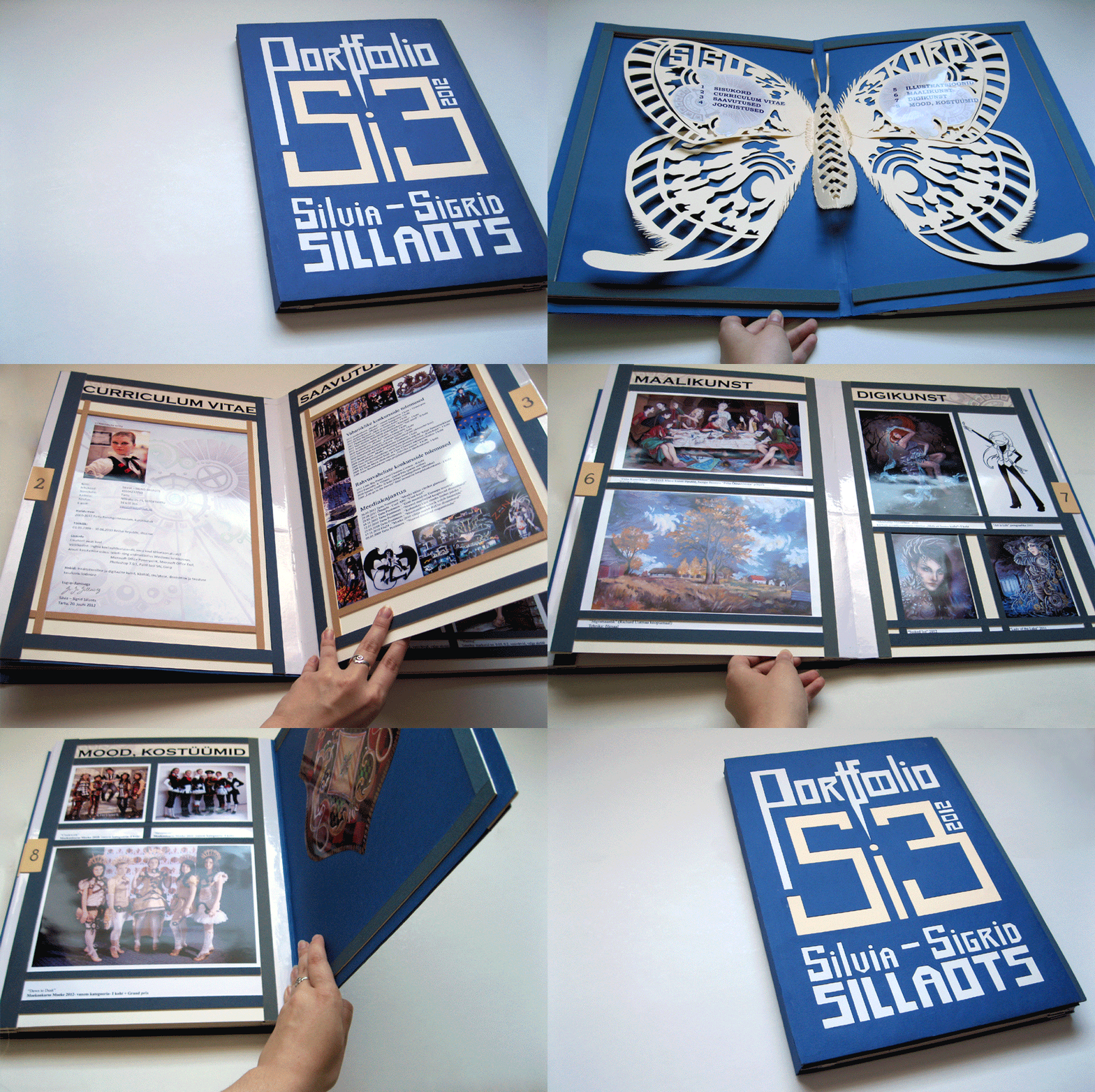


And thats it. Well... As much "sweat, blood and tears" I put into it, I can finally say, that this wasnt what the judges were expecting. In both good and the bad way. 
Good- yea... lots of hard work and impressive content. 
Bad- I crafted the damn thing.  >:I

This rather shows Im a crafter and not ready for "dry text processing, animations and videos". 
Hah! Go figure. :D
But at least I had fun making it. :) I just hope I can get it back now that I wasnt accepted to the school. :I

Monday, July 2, 2012

Underwater

As I've been obsessed with the underwater theme for some time, then here is the process of another watercreature aka a mermaid~ :3
 
 I remember I struggled quite long with the hands. :s But now its inked, scanned and ready for watercolours~

 First used some masking fluid. I guess everybody, who has used this liquid, knows way too well what it does to your brushes? :D I've noticed that its much better to use a wooden barbecue stick for applying this especially if you use the fluid for "drippy" white spots. ^^

 First layer of ink + salt. Used yellow, green and blue ink here.
 
 The second layer with watercolours + salt. Yup, double salty texture~

 More detailing and since I was pretty sloppy with the colouring, had to overdraw the main lines with black Unipin marker 0.1 and fixed some lines with white gel pen. (that water wasnt that blue at the bottom... damn camera.... D:)

Finally scanned and tried adjusting the colours as close to the original as I could. :)

Wednesday, June 27, 2012

The Last Art Class

 At the end of every school year we have to make a final thesis graduation art project as part of our art exams. You can make basicly anything for it, but I decided to go for a classical oil painting. As it was our last year together, I got an idea to draw/paint my classmates based on an old painting. And as we have a fairly small class, "The Last Supper" seemed like a legit choice. c: 
Yeah, for the base I chose Jacopo Bassano's last supper painting.
 
------------------------------------------------------------------------------------------------------------ 
 
 Started out with a sketch and nobody in my class was against the idea~
 
So~ Poked ppl and tried to get everybody in a similar enough pose as on the original,  smashed everyhting together and used this as my main reference for the painting. :3

  
During a week finally got  everything in place on canvas.


---------------------------------------------------------------------------------------------------------
 
 Figured I should do the portrait parts next after the bg was done. (not a good idea at all if you dont have a clear vision of the whole colour scheme! D:) Anyway, these two buddies helped me out with the portraits and used Louvre oils.

Its always good to have a reference pic nearby even better if side by side. ^^

 
This is the way I painted all of the portraits. First mixed a skin tone of ochre, sienna and white, covered the darker skin areas and then used a ligter tone of the same mix and tried smudging the lighter and darker parts together. Then added a bit of crimson red, burnt umber and itsy-bitsy ultramarine, higlights on the cheek and nose and finally added other details.  Its also good to paint over the hair part with the skin tone before starting with the hair.

Btw, this is me. :D
---------------------------------------------------------------------------------------------------------
 This isnt the finished version, you can see it at my Deviantart page. ;)
 http://blackbutterfly007.deviantart.com/gallery/#/d55fuz0

And here are some colse-up shots. :3


Wednesday, June 13, 2012

Family Dragon Shield

This was one of my school projects. :) All the students were given a blanc plywood shield shaped pice and the task was to desing your familys "coat of arms" shield part. 
This is what I did.
Its all painted with acrylics in lots of layers.  ;)

 As my father was born in the dragons year, my favorite fantasy creatures are dragons and it is the dragon year once again, it seemed the only logical choise that there shall be dragons on this. And gothic font. c:

 First painted the squared bg part with the tube red and darker lower squares are a mix of red and black.

Second layer with burnt umber + black, diluted with water and trying to get the "aged" look. Used the acrylics as watercolours and wiped over with a tissue  in the near-middle parts.

 Continued in school~ :D Did the green rombs the same way as the red part before.

 Now that everything in the bg is done, its finally time for the golden boarders. Also used a bit of metallic gold acrylic, but most of was done with a mix of ochre, sienna and burnt umber. 

And finally covered with mat acrylic varnish.
This is going to go up on the wall in my grandmothers country house~ <3